
The colors you pick for your bedroom can affect how you feel and sleep. Light blue can help you relax and feel peaceful, while soft green brings the soothing feeling of the outdoors inside. Purple makes a room feel fancy and sparks new ideas, while basic colors like white, gray, or beige let you easily change other decorations with the seasons. A few small red items can wake up your room's look if you use them carefully. When you know how different colors make you feel, you can make your bedroom a better place to rest.
Key Takeaways
Color choices in bedrooms directly influence emotional states, with light blue reducing heart rate and promoting relaxation for better sleep.
Gentle combinations like soft green with light purple or blue with sand tones create harmonious spaces that enhance mental calmness.
Excessive bright colors, especially red, can overstimulate the mind and increase stress levels in bedroom environments.
Strategic seasonal color updates through textiles and accessories help maintain visual interest while preserving the room's restful atmosphere.
Neutral colors provide versatile foundations for bedroom designs, allowing personalization while maintaining a peaceful ambiance.
The Science Behind Color Psychology in Interior Design
Colors affect us the moment we walk into a room - our brains notice them before anything else, and they change how we feel and think. This goes back to our early history when colors helped people find safe places, food, and shelter.
Now, designers use this deep connection to create rooms that feel right to us. How we react to colors isn't just about what we like - science shows real effects on our bodies and minds.
Light blue can make us feel calmer and slow down our heart rate, while bright red can make us feel more alert and active. These changes happen even if we don't notice them.
Because of this link between colors and how we feel, picking bedroom colors is now about more than just looks - it's about choosing shades that help us feel better and stay healthy.
Blue: Creating a Tranquil Sleep Haven
Blue is a calming color that reminds us of clear skies and peaceful waters, making it perfect for bedrooms. Soft blue shades like light blue or gentle sea green help create a quiet space where you can relax after a busy day.
To make your room even more peaceful, add different shades of blue throughout the space. You might want to paint the walls a light blue and add dark blue pillows, or hang blue curtains that let in soft daylight.
Using different blue colors adds richness to the room while keeping it calm and restful. Choose flat paint instead of shiny finishes, and add soft materials like cotton and linen to make your blue room feel more comfortable.
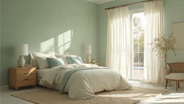
Green: Bringing Nature's Balance Indoors
Green brings the calming feel of nature into your bedroom. Using this color helps connect the outdoor world with your personal space, making it feel fresh and alive.
Adding green items like soft bedding with plant patterns or cushions in colors like sage, moss, or deep green can make your room more peaceful and comfortable.
Green reminds us of healthy plants and growing things, making it perfect for rooms where you want to both relax and feel refreshed. The color works well because it's not too bright or too dark - just right for making your bedroom a peaceful place to rest. For guidance on incorporating natural elements that complement green color schemes, explore our article on incorporating natural elements.
Purple: Adding Luxury and Creativity
Purple brings a special feeling to your bedroom that's different from natural colors. This rich color combines the feeling of luxury with creative freedom, making your room feel both fancy and truly yours.
Simple touches like soft purple pillows or curtains can turn your bedroom into a peaceful space that helps you relax and think creatively.
Dark purple walls make the room feel cozy and safe for sleeping
Light purple curtains catch and soften the evening light
Purple artwork on walls helps spark your imagination
Dark berry-colored pillows and blankets add rich detail to the room
You can use light purple touches here and there, or make bold purple choices throughout - either way, purple helps you be creative while keeping your room cozy and stylish.
Neutral Colors: Building a Timeless Foundation
While bright colors can stand out, neutral colors make a perfect base for a flexible bedroom design.
Simple shades like beige, gray, and white never go out of style and let you decorate in many ways.
These quiet colors blend well together to create a peaceful room that feels calm and relaxing. For inspiration on creating serene environments with neutral palettes, check out our guide on designing a serene retreat.
Red: Managing Energy and Passion
Red stands out from calm, light colors as one of the strongest colors you can pick for a bedroom. This bright choice affects both how passionate and energetic the room feels, so you need to use red carefully in your sleeping space.
When used in the right way, red can make your room special, creating a space that feels both lively and cozy.
Dark red throw pillows adding a soft, romantic feel at night
A red rug under your bed making the room feel warm and nice
Red artwork on walls making a bold look without being too much
Dark red blankets giving the room more style and comfort
It's best to use red in small amounts instead of large areas. You'll see that touches of this bright color can bring life to your room while keeping it peaceful enough for good sleep.
Color Combinations That Enhance Rest and Recovery
To make a room more peaceful, some colors work well together.
Soft green and light purple create a calm space that feels like being in nature. Light blue and sand-colored tones remind us of the beach, where the sky meets the shore.
For a deeper sense of calm, mix soft pink-purple with light gray - these colors help you relax but still feel warm.
If you like warmer colors, mix off-white with light orange-brown, which brings to mind sunny afternoons in warm places.
Pick colors that are soft and gentle, helping your mind slow down as you get ready to rest. For comprehensive guidance on achieving balanced color schemes in your bedroom, explore our article on creating a cohesive look.
Common Color Mistakes to Avoid in Bedrooms
Colors can make a bedroom feel peaceful, but many people make color mistakes that can spoil their sleep space.
Think about how colors work with your lights and furniture to keep your room comfortable. Bad color choices can make your bedroom feel less cozy or too busy when you need to relax.
Using bright red on big walls can make you feel stressed and make your heart beat faster
Picking colors that clash and fight for your attention
Using cold white colors that make the room feel too clean and empty
Painting all walls dark without thinking about where sunlight comes in. Understanding how lighting affects your color choices is crucial - learn more about lighting transforms bedroom furniture.
Knowing these common mistakes helps you build a better bedroom for good sleep and a peaceful feeling in your personal space.
Seasonal Color Updates for Your Sleep Space
Adding fresh colors to your bedroom can match the seasons outside, bringing outdoor shades into your sleep space.
Small changes - like using white sheets in summer or dark red blankets in winter - help your room feel more in tune with nature.
In spring, light pink, purple and green colors work well to match new plants and flowers.
Summer rooms look good with light blue and bright yellow touches.
When fall comes, add orange and brown colors using throw pillows and wall art.
Winter is perfect for deep, rich colors and warm gray or beige tones that make the room feel snug. For comprehensive guidance on refreshing your bedroom throughout the year, explore our article on seasonal bedroom refresh.
Changing colors this way helps your mood flow with the seasons, letting you feel close to nature while keeping your bedroom as your quiet space to rest.
Frequently Asked Questions
Can Certain Colors Affect My Children's Sleep Patterns Differently Than Adults?
Children react more strongly to colors in their sleep spaces compared to adults because their brains are still growing. Light blue and green colors tend to make kids feel more calm and sleepy than they do for grown-ups. For guidance on creating age-appropriate bedroom designs, check out our article on child-friendly bedroom furniture.
How Long Does It Take to Mentally Adjust to a New Bedroom Color?
Your brain will get used to your new wall color in about 2-3 weeks. Some people feel right at home with the change right away, while others take more time to get comfortable with it.
Do Color Preferences for Bedrooms Vary Significantly Across Different Cultures?
Color choices for bedrooms differ around the world based on what colors mean in each culture. People in Mediterranean countries often pick blue for its peaceful feel, while many in Asia and Africa choose red to bring energy to their rooms.
Should Ceiling Color Match or Contrast With Bedroom Wall Colors?
Both ceiling options work well - matching your walls makes the room feel bigger and smoother, while different colors create a bold look. Pick what feels right and makes your room feel calm. For guidance on achieving proper proportions in your color scheme, explore our guide on perfect proportions.
Can Paint Colors Look Different Depending on the Type of Lightbulbs Used?
Paint colors change a lot based on the lights you use. When you switch between warm and cool light bulbs, the same color on your wall can shift from feeling warm and homey to cold and stark.
How Can I Incorporate Multiple Colors Without Creating Visual Chaos?
Start with one main color and add two accent colors in smaller amounts. Use the 60-30-10 rule: 60% dominant color, 30% secondary color, and 10% accent color. For inspiration on mixing different tones harmoniously, check out our guide on mixing wood tones.
Conclusion
When you're designing your bedroom sanctuary, remember that color isn't just about aesthetics - it's a powerful tool that shapes your emotional well-being and sleep quality. Pairing your chosen palette with beautifully crafted pieces from Timbur can transform your space from simply a room into a deeply personal haven. Trust your instincts while keeping color psychology in mind, and you'll create the perfect backdrop for rest, rejuvenation, and self-expression with furniture that complements your color choices.